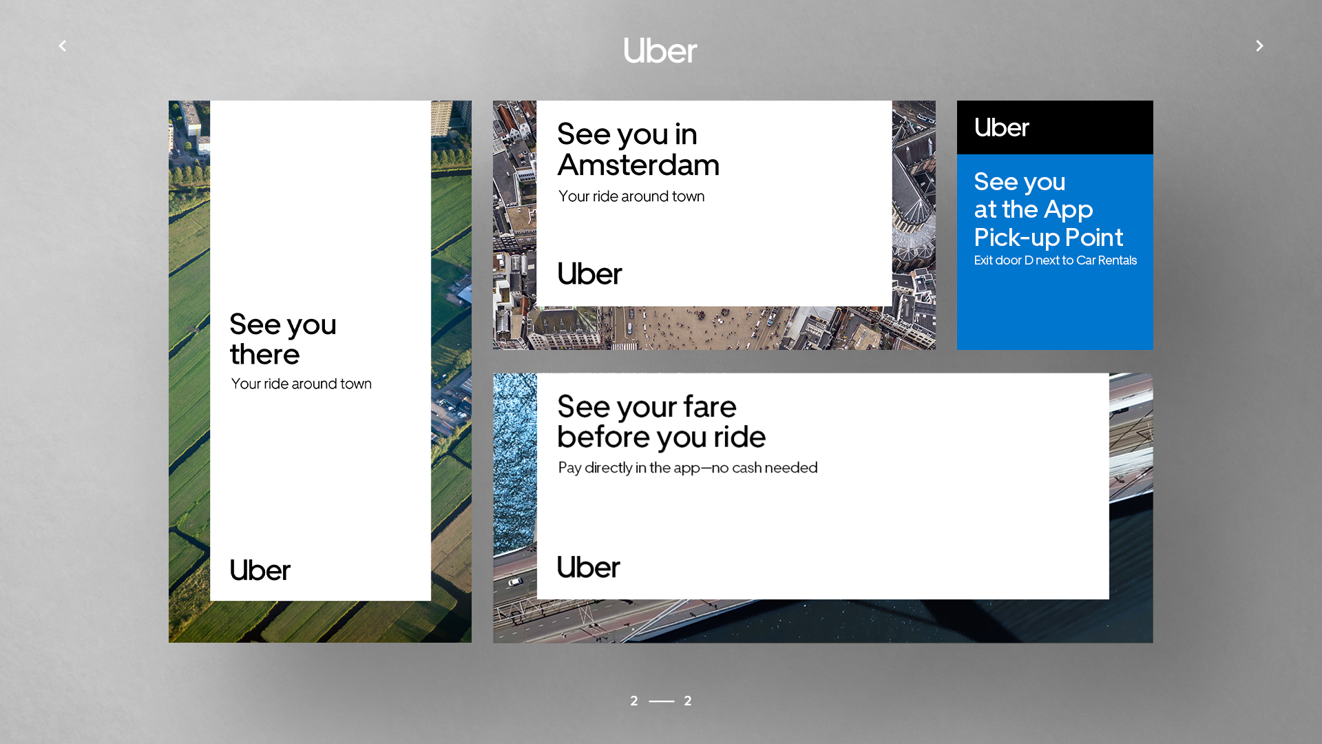
During my time at Monks in 2020, I had the opportunity to work on the rollout of Uber’s new campaign in the Netherlands. As part of the project, I was invited to Uber’s headquarters in Amsterdam for the creative briefing. One of the strongest elements of Uber’s visual identity, in my opinion, is the consistent use of the iconic U-frame. It transforms the “U” from a simple logo into a functional design system that defines layouts, aspect ratios, and compositions across the entire campaign.